Monday, March 29, 2010

http://muse.jhu.edu.ezproxy.uow.edu.au/journals/the_journal_of_aesthetic_education/v040/40.2kim.html you'll need to log in to see this I think through uow, the title of it is called:

A History of Design Theory in Art Education

Okay here is an example of how it turns out.
http://rapidshare.com/files/369841222/Cover_content.rar.html
if you don't have winRAR download it, it's free here
http://www.rarlab.com/download.htm
http://rapidshare.com/files/369813921/blackoutCutout.tif.html

The cut out size and letting in 300DPI the first square is the size of the actual biz card, the next is the probable 5mm each side bleed needed on the cut out so not to dent the paper if cropped slightly over.

let me know if there's any problems.

http://rapidshare.com/files/370179008/blackoutCutoutFixd.tif.html
new link should work

I make, you fix!

OK

Here are some revised versions of the inhouse docs

Note:

- Changed from greys to 2 monotony colours as Jesse wanted, not def sure it's what you wanted exactly but it looks alright. I took it to 50% opacity so when printed should be able to write on it. Let me know?

- 2 versions of the daily one 

- Pick at it for any changes we can make on Thursday

- Have not yet put the finalised blackout logo in yet so this is still very much just draft stages

http://rapidshare.com/files/369484598/dailytimesheet.pdf.html

http://rapidshare.com/files/369484599/Weekly_TIMESHEET.pdf.html

http://rapidshare.com/files/369484600/WIP_SHEET.pdf.html

http://rapidshare.com/files/369484601/Version_2_DailyTimeSheet.pdf.html

good good good fun!

ACCOUNTABILITY (not necessarily you are actually doing it though)

Emily:
- A4 Box
- Business Card
- Envelopes

Jesse:
- CD
- Inhouse Documents
- Extra Stationery

Annie:
- Book
- Brochure

BY THURSDAY JOB GUIDE!

Jesse:
- Cover Page Content (find military words and replace with design, good if we can see this before thursday, would love to contribute a little even as it sounds fun to replace words with design - also because it IS our front cover)

- Brochure Design Idea Proposals

- Box Folding

Emily:

- Stationery

- Wood Carving (more important)


Annie:

- Return Brief Content

- Inhouse Documents

quick minutes

Desn301
Classtime 1:30 - 4:00

CONTEXT
Went through Jesse's work on tyography
Emily's work on different stains, brush strokes, paint mediums etc.
Went through Annie's work on Inhouse documents

Discussed ideas for Stationery such as:
  • Poster
  • WIP
  • Business Cards
  • Comm Slip
  • CD Cover and CD Slip
  • Envelopes
  • Website/Email Signature

------------------------------------------

TODOIN3CATEGORIES

Stationery
This is the stationery we definitely need to do:
  • Business Card
  • Envelope
  • CD Cover/Cd Slip
  • Comm Slip
  • Letterhead
  • Inhouse Stationery
Business Card:
- Use thicker cardboard (really awesome grainy type, recycled?)
- indent with wood stamp thing, with black in the indent.
- indent vs outdent?
- can we print on this cardboard? If not, make a stamp?

A4 Box to hold our content instead of A3 portfolio - made with same stock as business card

Brochure
Pull open brochure thing

Creative ways to handle the handles on either end

Look into ideas such as cutting holes into the handles so it comes through in the paper, and opening up the pamphlet to reveal a cut out of the word 'BLACKOUT' so people can 'blackout' what they wish using the pamphlet

Profile Pictures - to be taken and blackout faces/eyes, need a blurb each person of 200 words on design etc.

Also need a blurb about the company identity

Contact details


Book
  • Cover Page
  • Content Page
  • Return Brief
  • Style Guide
  • Logo identity and group identity
Cover Page:
- Camera SLR and tripod
- Lightbox
- Acetate Paper - can print at uni library on A4
- Content for lightbox - use a military thing replacing words with design???


Sunday, March 28, 2010

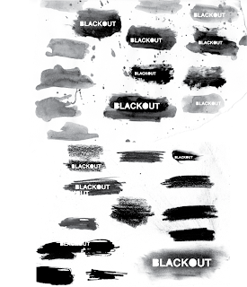
splotches


Been playing around with ink, paint and pencil and finding what effects I could achieve..
Here are some of them...

blackout...


Here is what I had been working on up to our meeting last Thursday. Sorry it's taken me so long to get it up...I had some problems trying on the weekend. So working with the word blackout I have played with transparency and the idea of choosing what is being shown and the way it is shown. My favourite is the bottom which is a lot simpler and ended up being along similar lines to what Jessie was experiment with.

Saturday, March 27, 2010

INKSPOT


Just posting up the stuff I did for the last meeting.

Played with ink and some permanent markers still running loosely around the barcode theme which has now been dropped.


Minutes of 25 march

Desn301
Group Meeting
25/03/2010
2:30pm - 4:30pm

Read Logos are Dead article

Discussed changing from barcode to blackout officially.

Went through each members ideas and proposals and work they had done.

Discussed the concept behind the name
Morbid theme of censorship
Photos are desaturated, monochrome
Sterile Look
Experiment with diff textures/treatments of the word BLACKOUT
don't need a pictogram, purely word and the style and image that comes from it
can try having different letters censored out of the type
Unrelated to good/evil - no morals
We have a choice
Censorship is similar to crop, we choose what we keep and take out
e.g. cutting out parts of photos or blocking out things

Ideas for book
Creative binding, e.g. tie it together by hand with string
Pamphlet, interesting fold out
Stationary ideas e.g. stickers and badges

Thursday, March 25, 2010

Typeset

http://rapidshare.com/files/368247948/BLACKOUTtypeSet.pdf.html

Job List for Monday

Emily:
Explore mediums of backing for the type set "BLACKOUT"
mediums to explore prehaps;
watercolour, acrylics, spray paint, charcoal, pastels, lead, etc.
Remember; try stick to rectangle shape for at least a good portion of each experiment.

Additionally, scans of thick permanent marker lines which trail of would be great too. And some scan of some lower fibered paper for texture of "BLACKOUT" word.

Annie:
Skeleton of Time Sheet, Unique fold apart from gateway, emailing Jo about size restrictions of return brief etc, prehaps start thinking about mediums for printing, where, on what, etc. begin writing a pro and con list of logo strength and weaknesses.

Jesse:
Create unique lettering for blackout to distinguish it slightly from other common found typefaces -- appealing more to the imagery and concept behind BLACKOUT, find complete usable typography which would be used throughout documents and stationary.

Wednesday, March 24, 2010

http://www.allgraphicdesign.com/graphicsblog/2007/11/the-coolest-business-cards-use-of-cool-shapes-textures-creativity-talent/
Part 1 - 6

http://www.logodesignlove.com/best-logo-design-resources
Food for thought.

http://weburbanist.com/2009/12/14/less-is-more-18-clever-logos-using-negative-space/
Negative space.

http://www.logodesignlove.com/10-handwritten-logo-designs
Successful naive design.

http://www.logodesignlove.com/logos-are-dead
Read this.

http://www.logodesignlove.com/vintage-logos
and if you don't care for the article.

http://wellmedicated.com/inspiration/50-amazing-gig-posters-sure-to-inspire/
50 band posters. Many of them retro.

http://www.reencoded.com/2009/08/10/50-beautiful-graphic-design-portfolios/
50 amazing designers.

http://webdesignledger.com/inspiration/50-inspiring-dark-web-designs
unconventional dark coloured webpages.
particular attention to number 1. The texture and layout are very nice.

Blackout


Idea formation (mistake):
http://rapidshare.com/files/366526407/Bl
ackoutCollective.pdf.html

Sunday, March 21, 2010

BLACKOUT vs BARCODE


22nd March 2010


This is what I had been doing in class before Jesse sent a pdf with the idea of using BLACKOUT instead of Barcode.

Now we are working on that concept and applying it to both new ideas and concepts we alreadt have. feel free to let me and em know what you think about these ideas Jesse.

and give us like an hour to get together a few things to propose to you.

Jo emily and I are of the opinion we should make the name just simple

BLACKOUT

dropping the collective and keeping it simple. similarly when we still were using barcode we felt it was stronger just barcode without the collective....

are you ok with the name being just simply BLACKOUT? and oh we cnvinced jo that blackout is a verb yay!

Wednesday, March 17, 2010


Here is what I have been playing around with. 
Textured barcodes and also some in watercolour..
Just seeing what effects I can get.
I'm liking the feel of the watercolour, (but I realise it is more of an effect rather than a concept jessie..), just exploring how to incorporate a handmade, more organic element into the logo.
let me know what you guys think..
I haven't been thinking of names (sorry annie!).. but I just wanted to get this up!
See you tomorrow..

Barcode Mania!

Jesse did this and didn't have a copy so here is the thing he did for last class ^

And here is some more summary and maybe we can keep discussing in the comment box?
17/03/2010 Met Up from 12:30 - 1:30

Discussed barcode and ideas with it - not a lot of progression as not much time to work on it.

We know we want to NOT COPY and we don't want WANKY NAMES

Everything is still very open.

Also discussed packaging and stationery ideas and tossed up between importance of design concept as a whole and creating a logo identity and applying it to stationery. decided it needed to be a balance.

extra idea:
Barcode Division
Barcode Collective
Just quickly updated Jesse's logo to see how it looked this is just more to illustrate the new name that is on the books.

I'll try to come up with some more names.. maybe we could start putting comments on this blog with name ideas for barcode?


Tuesday, March 16, 2010

Interesting creative business card

http://www.webdesignerdepot.com/2009/05/100-really-creative-business-cards/

Some sites to look at

So the two sites I was showing you guys the other day were packaging and resumes.

I really think there could be something there in making our identity ... really smart like these examples. Really play up the barcode and have clever business cards which utilise barcodes.

e.g. our Business card could be a cardboard box or a packet of gum type thing? you know like in a box.. and the barcode is our logo and ... yeah

anyway I'll have a think about it and get back to you guys tomorrow. What the bad news I wanted to say is that I went to Canberra today and then got home and went to work and I'm so so buggered and have a headache so I really can't think of any ideas :( I'm SORRY I really did wanna try and come up with some logo concepts

but instead I will go to sleep and dream up lovely ideas for our stationery!


minutes with jo


15/03/2010
1:30pm - 3:30pm

Proposed our ideas to Jo starting with our first choice:

The New Black
- discussed idea of overprint, doubleprint, offset? (printing wrong so black is darker)
- liked the idea but felt concept needed work to ensure it worked well in all situations and was adaptable
- she suggested making it just "New Black" and also said it was a bit wanky (lololol)
- thought this idea could really work!

Crop
- she felt logo should be 2colour/1 colour as it is more adaptable
- liked the word "Crop" by itself but worried that it would be mistaken for planting terms

Barcode
- Felt was good as it could "change with the purpose" and be applied to anything e.g. likehow google changes it's logo
- Wanted us to explore changing the logo for print, or thinking, or web, (e.g. diff sections/genres)
- Barcodes are set in stone but we are not JUST A BARCODE

She also liked Point Blank.

---------

We discussed Barcode as the one to concentrate on for the moment and want to work on:
- how to reduce Barcode without losing the textures created in say a spraypaint job
- what kind of texture to make this logo with? e.g. ink, texta, spray?
- typography? e.g. do we stick with just barcode or add another word?
- actual design identity and design direction
Hey guys - good and bad news. and I doubt either of you will read this anyway before we meet up tomorrow. But it will be here to show off tomorrow lol.

I found my lil art diary! YAY. haha actually it's not fantastic news but it means that I can sorta recap the meeting from the other day.

11/03/2010
10:00am - 1:30pm

- Involved heavy group discussion on all logo choices with emphasis on "The New Black" and Crop" and how we could use it. e.g. crop (can be detailed logo or greyscale) and new black (creation of UV through contact paper and making cut outs)

- Also reviewed other words which had not had concepts applied to them and tried to come up with some quick ideas as a group

- Rated our ideas into a list of the top 10

- Discussed Printers and idea of looking into printers outside of Wollongong

- Worked on timeframes for having job completed by Week 6

Will write the rest in next blog

Sunday, March 14, 2010

Just a quick update

Met up Thursday. Lost book with minutes in it but this is the list of the top names we came up in order from what we like the most to what we like least.

Our Top 10

The New Black

Crop

Barcode

Point Blank

Half Tone

To be...

Custom New

Open Frame

Afterthought

Humdrum


Examples of logos using Barcodes:


Wednesday, March 10, 2010

cropping revised..


Hi team.
Here is what I have been working on this arvo..
The edge isn't really happening for me, I don't have a strong enough concept..
I've been working on crop and playing with type and also putting some of my old photos from the stomp project just to see how things are flowing.

The ones on the right side are my favourite. I like the idea of cropping an image behind the text, or cropping certain parts of letters, but I'd love feedback and if you guys don't like it that is so fine. 

Excellent, well I will work further on the weekend but I just wanted to put something up!


Under My sens!

Some Quick Sketch ideas/proposals for Logo design...

OK. These images are annoying and won't go in the right order. This is my least favourite I think. So I guess we will have to start with it anyway.

Open Frame

Basically the simple concept is the idea of "Frame" being a reference to photography - something we all like. "Open" in reference to us being open to experimentation and an easy way to represent this is to of course just have an open box.

Ideas to make this better include:
  • better typography
  • having the words "outside the box" (or is this too clique?)
  • somehow making the type come to life by trying to open the frame? e.g. Figure C where if you look close the O has a lock hole in it... it's probably too small for you to see....

Humdrum

Yes it is a negative connotative word. Yes it does imply many bad things that we do not want to think ourselves of. I am only pushing this one because it was there and it rhymes. It would be fun to try and make our group a paradox - a group where we turn the meaning upside down as a contradiction on itself. Can't say I'm a fan of these but it's a start...


Creative Crop

Well, after working with Jesse today on the logo - we thought "Crop" was a better substitute to "Frame" and set about trying to think of words to go with Crop. Simply, Creative Crop uses alliteration and has a few nice layers of meaning behind it. It was kinda fun to play with quickly.
Figure A. there is a crop horizontally across the word and then I just moved the bottom half slightly to the right...


Custom New

One of my concepts for our group's personality is one of coming from traditional backgrounds of visual arts and of sketches and the handmade touch. Yet, as designers - we bring together this traditional sense with the modernist design and create something entirely new. "Custom" was a synonym of Tradition and New is ... new. therefore - the combination of old and new. It is not meant to be that clear - it just flows off the tongue nice in my opinion.


Straight Dub Mix


Howdy Folks!

There's a fun scan of the mess of notes and scribbles I've taken to arrive at some of my initial ideas.

Now, just to sum up where we are at the moment for future and present reference. Just ski[ this part if you don't mind.. :P It's more for my memory. We are trying to come up with an identity for our group which reflects our personality through a strong concept. As a group of "innovative designers wanting to get themselves out into the world" our name should be STRONG and CREATIVE and PROFESSIONAL as it will be used while working on real client based jobs.
In class (8/3/10 Wk 2) we started to brainstorm "verbs" because we HAAAVE to use them *eye roll* We looked at examples of logos Jesse found which used negative space, as well as other effective, witty logos. We decided we wanted our logo to be clever and in an illustratory direction. Using an online verb generator, words which we came up which we considered included:
  • heckle
  • bebop
  • devour
  • meep
  • lilt
  • flit
  • clink
  • cavort
  • humdrum!
From here on in, we spent the next few days individually coming up with ideas. This is just a quick (maybe not that quick... I write long blogs sorry I'll try to contain myself next time) blog to fill you in on my thoughts.

10/3/2010
Sent out an email with a list of words and ideas for company names. Here they are for your viewing pleaaaaasure.

Direct Detour (i feel representative of how we tend to work in design)siren call

Three Ink.

Free Ink. (that’s jst because I can’t say the TH sound… lol)

solid proof

Sketchy

catching my drift

Paint it black

Parting Words

Jumping Rooftops

Ironic Kick

Ironic Twist

Paper Space

Parting Composition

Part Design Part Style


Random words

ticking

heckle

Illuminate

Reverse

stump

Step Back

Caught Up

Blend

Humdrum

Beebop

Meep

Clink


We decided random words were not getting us anywhere and we needed to come up with some design concepts with our design group names (as Jesse demonstrated in the first blog)


Looked at the name Urban Barcode and that was really interesting to see barcode logo designs and how flexible they could be! Amazing stuff!


Other than that more names I came up with include:


- new tradition

- custom new

- halfcrop

- an afterthought

- pointblank

- veer left

- corner frame

- urban barcode


This blog's formatting has gone all wack so I'll upload my tonight's work on the next one. I dunno why it's so stuffy :(


Ciao for Now.

crop.

I've been working with the idea 'crop' as we all seem to like it. 
This is what i've got so far but i'm struggling.

off crop
out crop
crop air
crop tool
crop mark
velvet crop
black crop
crop proof

i'm so sick of the word already.

some other ideas..

outline
blackout
direct space
black edge
flat edge
black spark

words i like, wade, see, edge, spur, plug...
but at the moment they are just mostly single words.

I agree it would be great to meet up and talk it through. 
Hopefully tomorrow.. Il wait to hear tho.
Sorry i have to go offline now!


Tuesday, March 9, 2010

Names


Alright, this is our new blog for "NAME PENDING", anyway here are some ideas I've come up with."to be..."
"to be or not to be" = "√4b²" which "= 2b or -2b"
"HALF TONE"
"Devour" which I have a logo for but am not uploading as it too... cli
che I guess, it's the word with a worm teeth inside the 'o'.
"Kerning" as a name, but it looks like keming. GETIT.

"BOP" or "BEBOP" but I've come up with a logo for them and it really doesn't work.
"the new black"
"black is the new black"
other names:
"ball and chain"
"Snake versus sparrow"
"Born a pirate" <-- have an image but need to scan it, tho it's not that good.
"Play on words" with the a being a play symbol. Hurp-durp.

"The new black" or "black is the new black" works by having a UV spotting over the top the warm black colours thus making it visible on stationary, we could do that by getting a dye cut
made up of our letters in metal cookie cutter stamps and stamping out clear contact sheet for books and placing it over the top to make the words. get my drift? doya.

for a website the words would just both be on different black one warm one cold, it should be easily recognisable, regardless even if you can't read it, if we ma
ke the grunge good enough our identity will be a square of grunge, with the words in it just hard to read. I like the idea. There also some way to make the black double print so it will print black on top of black and double layer it.

----ADDITIONAL NAMING DONE JOINT WORK ANNIE JESSE---

I'll let annie put up her name and concepts but this is the idea I came upon when using her name frame corner, I find that frame isn't designer enough, but crop is this is my play with it.

CROP--"SOMETHING" ie: